Simplify Your Packaging for a Better Customer Experience
In this day and age people have close to zero patience when it comes to waiting for information. Luckily enough, we can find out just about anything with a click or two. When it comes to something like a tangible product, however, the messaging is not always as straightforward.
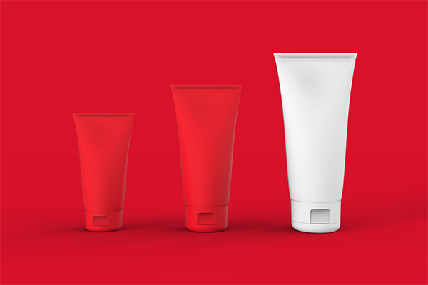
The trends of packaging and design are understandably hard to follow– who has the time and money to change it up every time a new trend is introduced into your industry? This doesn’t mean that some trends aren’t meant to stick around though. The packaging trend of straightforward messaging and design can alleviate some of the headache that consumers face when trying to decode a package. After all, what company has it in their mission to cause frustration to the people that are keeping the lights on? Here are some tips from us to you on how to keep your packaging direct:
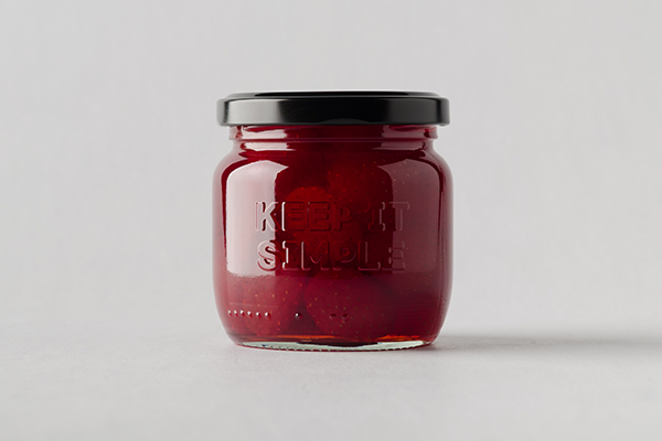
- Use bold typography to highlight the main features and differentiation points.
- Figure out how to condense your message on the package itself- most people don’t care about the whole story so keep it short.
- Use contrasting colors in order to draw the eye to specific words and phrases. Maybe a monotone color palette with a pop of color.
- Let the shape of your packaging do most of the talking. Having a unique shape on a shelf can equal brand recognition and brand engagement.
Even slight changes to a package can increase sales by being more user-friendly. Here, at Imagemme, we understand this desire within companies.